
Single Product Page Layout Issue with Variable Products

Hi,
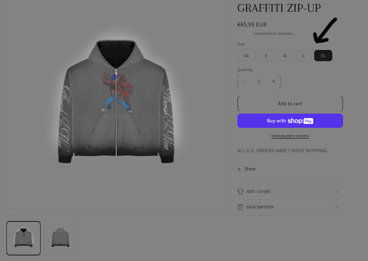
I'm using BeTheme with WooCommerce and have successfully customized my single product page layout for simple products. However, I recently added a variable product (with size variations), and it has distorted the design compared to my previous layout.
I’ve attached two screenshots:
- This is the desired design.
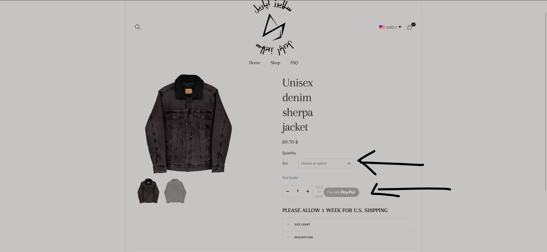
- This is the current product page with variations, showing the issue.
I want the variable product page to match the exact layout of the simple product page, including the positioning of the elements, styling, and overall appearance.
Additionally, instead of a dropdown for selecting sizes, I’d like the sizes to appear as round buttons (or swatches) for a cleaner and more user-friendly design.
Could you please guide me on how to achieve this while keeping the variation functionality intact? I'm open to modifying BeTheme settings, custom CSS, or using a child theme if necessary.
Thank you for your help!
Comments
WP/FTP access is still the same in case you want a clear view!
Thank you!
Kind regards
Hi,
Please use the following CSS code:
.single-product .woocommerce-variation-add-to-cart{
 flex-wrap: wrap;
}
See the following video tutorial:
https://support.muffingroup.com/video-tutorials/how-to-use-woocommerce-attribute-swatches/
You may also want to extend Add to cart element to 1/1 width.
Best regards
Hi,
Thank you for the fix and the tutorial link! I’m still working through this.
As you can see on the second screen, the highlighted elements are completely distorted!
All I want is to replicate this design (first screenshot).
Much obliged.
The button would be as in your example, but you have the following custom CSS code that prevents it from working properly:
It looks like this without this:
The button display to have a border, etc., can be adjusted in Betheme -> Theme options -> Global -> Buttons:
Or as you have it now, in overwritten in the template:
To put Quantity text before the quantity box, you can try the following CSS code:
.single-product .woocommerce-variation-add-to-cart .quantity:before{
 display: block;
 content: "Quantity";
 margin-bottom: 8px;
 color: #000;
}
.single-product .woocommerce-variation-add-to-cart .quantity-change{
 top: 22px!important;
}
Best regards
Hi, I hope you are doing good.
Ive successfully fixed the buttons alignments following your instructions, which I find great!
The other things I would like you to enlighten me about are those four main points:
Thank you for your valued assistance!
Kind regards
I have updated my login credentials and sent them to you via this link [Links visible only for registered users] to have a clear view.
Thank you !
1) It comes from one of your plugins. To find which plugin adds it disable them one by one.
2) Border radius option is here:
Or here:
Note that you did not assign border width:
3) Yes, you should add it as Plain text or Column Text in the product template:
To look like this, change price element width to inline:
Best regards
Hi there!
One last thing I would like help with is how can I make my size variations display like this upon selection?
Appreciate your help as Ive learned so much from what you've told me.
Thank you so much
Appreciate it
Here's a well detailed screen of what I'm trying to setup.
Thanks!
2) By CTA, do you mean the "Pay with PayPal" button? If yes, most plugins have their styling setting in the plugin options.
If you do not see anything there and the plugin author does not provide customization options, let me know, and I will check if this can be done with custom CSS.
3a) To have a link on the word "shipping," simply put it in the <a> tag. So it should look like this:
In place of #, put a link to the page you want.
3b) Also, put text next to the price decrease the width of the Text element:
4) Your variations already look like this:
I am not quite sure how you want to change them.
If you mean the black background for the active variation, please use this CSS code:
.single-product .mfn-vr .mfn-vr-options .active a{
 color: #fff!important;
 background: #000;
}
Best regards
2) Yes by CTA I mean the call to action button which is the plugin's PayPal button in my case as I don't have any ability to align it beautifully with my Add to cart button.
Those are the only design options I have:
Though I don't think my payment plugin have an option to expand the button to fit the add to cart element along with its dimensions if I'm not wrong.
3) a. Done, thank you !
b. I've managed to do it, I like how things look in Betheme appreciate it.
4) Yes you're right, I mean the black background when the variation is active. The CSS did the thing!
Thanks. Appreciate you!
Kind regards
2) I can see that it is wider now:
But there are still some pixels missing to be the same width as the add to cart button.
However, I checked that, and it is displayed using iframe, which means that no external custom CSS codes will affect it.
In this situation I can only recommend contacting the plugin author if they can provide a solution for your desired design.
Best regards
Hi,
here is what I've received after contacting the plugin author.
I quote:
" Hi Youness,
The reason the button isn't expanding is because PayPal internally limits the max width of the PayPal button to 750px wide. It will not expand beyond that length because they control that with internal code.
Unforuntately there isn't a way to change that limitation. "
So it means that, unfortunately, there is no way to change this button further, and my hands are tied.
Please let me know if I can help you with anything else.
Best regards
In this case, I would like make the Add to cart button fit the 750 width of their CTA button or any width that would look correct on my page display! How about this ?
Thanks!
Kind regards
To*
The most important thing for me is to ensure a natural look for this, that's all
Any suggestions are welcome. If it gave you a headache, no worries!
I'll improvise a solution.
Best regards
You can decrease a little add to cart button element:
Best regards
Perfect! I'm currently working on it, thank you so much
Appreciate you!
Kind regards
Hi, I need help adjusting how my size variations are displayed on the single product page.
Currently, the size options (S, M, L, XL, etc.) appear on the same line as the "SIZE" label.
I want them to appear directly below "SIZE" as shown in the screenshot below:
I've attempted the following CSS, but it didn't work:
.single-product .mfn-vr label {
display: block;
margin-bottom: 8px;
}
.single-product .mfn-vr-options {
display: flex;
flex-wrap: wrap;
width: 100%;
margin-top: 8px !important;
clear: both;
}
The size buttons are still appearing next to "SIZE" instead of below it.
Can you provide the correct CSS or suggest a setting in BeBuilder that ensures the size variations appear below "SIZE"?
Kind regards
2) Also, I would like to let you know about another issue Ive encountered which is the cart page on my back end isn't displaying the elements correctly on the front end!
As you can see on the following screenshots, things are a bit distorted!
Thanks!
Number 2 is fixed thank you!
Only the size line issue left!
Kind regards
The cart page keeps getting distorted on the front end again :/
I'm a little bit confused about the overall page creation in Bebuilder. As I'm finding difficulties to relate on how templates are automatically overriding normal pages! Otherwise when I create a new template should I go and add a new page ? How can I assign template to the proper pages? And how can I make sure I handle Woo commerce advanced default pages settings seamlessly with my templates (default cart page, default checkout page..) ?
I find it a bit tricky ! Could you enlighten me more on this?
Thank you!
Kind regards.
1) Edit Add to Cart element, and in the Style tab change Label position from Inline to Top:
2) It looks like this for me:
Did you handle this again?
3) I suggest checking the following video tutorials:
https://support.muffingroup.com/video-tutorials/how-to-use-templates-a-step-by-step-guide/
https://support.muffingroup.com/video-tutorials/cart-checkout-thank-you-page-builder/
https://support.muffingroup.com/video-tutorials/how-to-customize-woocommerce-single-product-layout/
https://support.muffingroup.com/video-tutorials/how-to-create-custom-template-for-the-shop/
They explain how templates works.
Best regards
Here's my active checkout template! But once I proceed to checkout on the front end, I get this!
I've already seen all the tutorials you've sent me, as they are not highlighting my issues.
My work as well as my client's is somehow halted because of this!
Thanks
Kind regards
They are highlighting my issues*, my bad! I mean they aren't highlighting the error I'm getting!
I'm working on it, as I'm following the instructions you gave me
I will get back to you with updates asap
Thank you so much !
Appreciate you!
1) Thank you for real! That helped so much, I fixed it!
2) Here's how it looks like when I edit my Cart template with Bebuilder:
And here's how it looks like when I preview the page template using the builder which looks correct:
But the issue is when I go check the back end display! You can see what I mean in the following third screenshot:
3)I got what you're saying, as I found the videos so helpful and detailed.
I've discovered so many features that I didn't even realize that they were in Betheme.
Thank you so much!
Appreciate your guidance
Kind regards
2) I have a little difficulty finding what you showed on the third screenshot.
Can you guide me on the path to replicate it, please?
Thanks
Hi, you can click on "View cart" in the store side cart. Check this out: