
I'm having two tricky problems with my website:


I'm having two tricky problems with my website: [Links visible only for registered users]
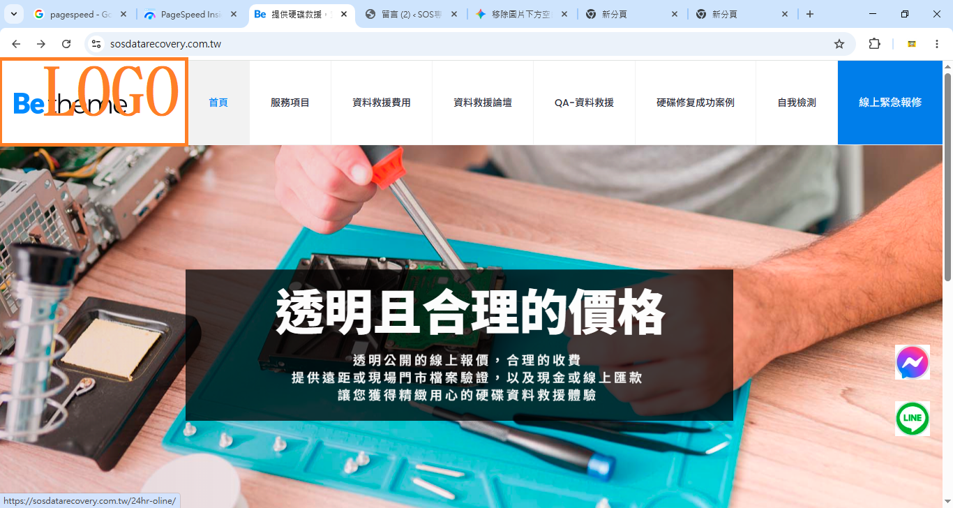
1. My logo on the left is displaying unclearly despite being designed.
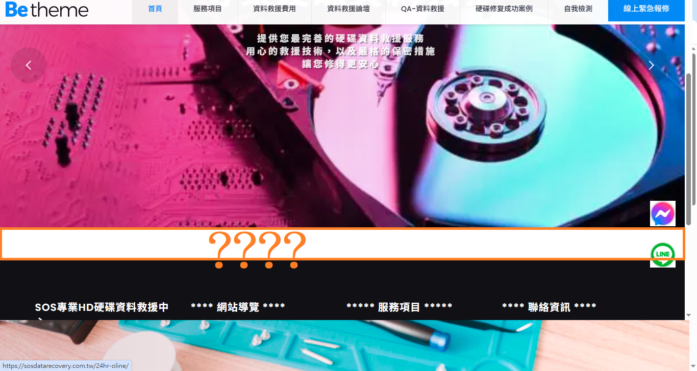
2. There's a 1.4cm white line below the banner that I can't seem to remove. Could any expert help me? Thank you!
Comments
Hi,
1) Did you change your logo in Betheme -> Theme options -> Global -> Logo?
Did you purge the cache on your website?
Did you try disabling your plugins?
2) There are three empty containers in Elementor causing this gap:
To get rid of this gap, remove these containers.
Best regards
Hi,
1) Did you change your logo in Betheme -> Theme options -> Global -> Logo?
A= I tried changing the logo, but converting the original PNG to a WebP file made the file too large, slowing down the page.
Did you purge the cache on your website?
A=Yes, clearing too quickly. litespeed catch
Did you try disabling your plugins?
A=I don't know of any disabled plugin images that I haven't used!!!
2) There are three empty containers in Elementor causing this gap:
A=Could you please help me fix it?
1) It does not have to be plugin for images. Please disable all of your plugins, and check if the problem persists.
2) Please edit this page, and remove empty containers.
Best regards
Could you please upload this logo image for me? I'll provide the account and password because I don't know what to observe when all plugins are disabled. Thank you.
Please send us the WordPress dashboard access privately through the contact form, which is on the right side at [Links visible only for registered users], and we will check what the reason might be.
Notice!
Please attach a link to this forum discussion.
Sending incorrect or incomplete data will result in a longer response time.
Therefore, please ensure that the data you send are complete and correct.
Thanks
You did not have any logo set in the theme options:
I have set it up, purged the cache, and it displays correctly:
Best regards
Hello, thank you for your help and assistance. We are currently encountering the following issues:
I had set up that feature before, but the logo wasn't displaying perfectly at the right size, so I deleted it after adjusting the size.
1. The logo is too small to be clearly visible on the mobile device.
2. The desktop version fails to display correctly when parsed by PageSpeed Insights. Website Experience Core Metrics Assessment: Failed.
3. Can all navigation items on my mobile device be aligned to the left?
1) You can upload a larger logo for mobile display in Betheme -> Theme options -> Responsive -> General:
2) I have checked that, and it passed for me:
3) You have the following CSS code that moves menu to the center:
When you remove it, it will be aligned to the left.
Best regards
hello nice toomeet you
1If a larger badge is displayed clearly and almost fills the entire screen on both PC and mobile versions, what dimensions would you recommend for its length and width?
2Could you please help me revise this? Thank you.
/* 1. 修正選單容器:讓它撐滿剩餘空間並改為靠左對齊 (方便內部平分) */
.menu_wrapper {
flex-shrink: 1 !important;
flex-grow: 1 !important;
text-align: center !important; /* 確保內容置中 */
}
/* 2. 修正選單主體:將 justify-content 從 flex-end 改為 space-around */
#Top_bar .menu {
display: flex !important;
flex-wrap: nowrap !important;
justify-content: space-around !important; /* 關鍵:讓項目之間均勻留白 */
width: 100% !important; /* 撐滿容器 */
margin: 0 !important;
padding: 0 !important;
list-style: none !important;
}
/* 3. 修正選單項目:讓每個項目「等寬」分布 */
#Top_bar .menu > li {
flex: 1 !important; /* 關鍵:讓每個 li 平分剩下的空間 */
display: block !important;
text-align: center !important; /* 文字在格子內置中 */
}
/* 4. 微調文字鏈接:拿掉固定 padding,讓它根據比例自動調整 */
#Top_bar .menu > li > a {
padding: 0 !important; /* 由 li 的 flex 控制間距,所以這裡設 0 或極小值 */
font-size: 14px !important; /* 字體可以稍微放大一點點 */
white-space: nowrap !important;
display: block !important; /* 設為 block 才能讓文字置中生效 */
width: 100%;
}
1) You must check what suits your website best. There is no specific value that will be perfect.
2) I am sorry, but I do not get what you want to revive. Please remove the part I highlighted in my previous screenshot, and the menu items will align to the left on the mobile.
Best regards